How to add dotted forecast line in an Excel line chart?
Let’s say you have created a line chart to display the sales amount in the first half year as below screenshot shown. But now, you need to forecast the sales amount in the second half year, and add the forecast values as a dotted line in the chart, how to deal with it? This article will introduce an easy solution to add a dotted forecast line in an existing line chart in Excel.
- Add dotted forecast line in an Excel line chart
- Add dotted forecast line in a line chart with an amazing tool


Add dotted forecast line in an Excel line chart
To add a dotted forecast line in an existing line chart in Excel, please do as follows:
1. Beside the source data, add a Forecast column, and list the forecast sales amount as below screenshot shown.
Note: Please remember to add the sales amount of Jun in the Forecast column too.

2. Right-click the line chart, and click Select Data in the context menu. See screenshot:
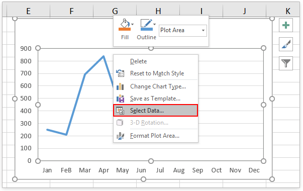
3. In the Select Data Source dialog box, please click the Add button in the Legend Entries (Series) section. See screenshot:

4. Now the Edit Series dialog box comes out. Please (1) type Forecast in the Series name box, (2) specify the Forecast column excluding the column header as Series values, and then (3) click the OK buttons successively to close the two dialog boxes. See screenshot:

5. Now the forecast line is added to the line chart. Right-click the forecast line, and click Format Data Series from the context menu. See screenshot:

6. In the Format Data Series pane, please (1) click the Fill & Line icon, (2) expand the Line section; and (3) Select Round Dot from the Dash type drop-down list. See screenshot:

Note: If you are using Excel 2010 or earlier versions, it will open the Format Data Series dialog box. In the dialog box, please click Line Style in the left bar, select Round Dot from the Dash type drop-down list, and then close the dialog box.
So far, we have added the dotted forecast line in the existing line chart. See screenshot:

Add dotted forecast line in a line chart with an amazing tool
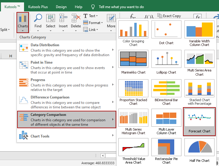
If you have Kutools for Excel installed, you can apply its Forecast Chart feature to quickly create a line chart which shows the actual values with solid line and display the forecast values with dotted line in Excel.
Kutools for Excel - Supercharge Excel with over 300 essential tools. Enjoy a full-featured 30-day FREE trial with no credit card required! Get It Now
1. Prepare the source data containing both actual values and forecast values in two columns, and select the source data.

2. Click Kutools > Charts > Category Comparison > Forecast Chart to enable this feature.
3. Now the Forecast Chart dialog comes out. By default, the ranges are filled automatically into the Axis label range, Actual value range, and Forecast value range boxes based on the selected source data. If they are incorrect, correct them manually. Then click the Ok button.

4. A dialog pops out and tells you a hidden sheet is created to store the intermediate data. Click Yes to go ahead.
Now a line chart is created. In the chart, the solid line part presents the actual values, while the dotted line part shows the forecast values.

Notes:
In the Forecast Chart dialog, if you have ticked the Auxiliary guides option, typed in or referred a cell in the below box, it will create a forecast chart with a horizontal line as below screenshot shown.

Related articles:
Best Office Productivity Tools
Supercharge Your Excel Skills with Kutools for Excel, and Experience Efficiency Like Never Before. Kutools for Excel Offers Over 300 Advanced Features to Boost Productivity and Save Time. Click Here to Get The Feature You Need The Most...
")
Office Tab Brings Tabbed interface to Office, and Make Your Work Much Easier
- Enable tabbed editing and reading in Word, Excel, PowerPoint, Publisher, Access, Visio and Project.
- Open and create multiple documents in new tabs of the same window, rather than in new windows.
- Increases your productivity by 50%, and reduces hundreds of mouse clicks for you every day!
")